Map tab shows all of your sensors, links, routes, and signs on the Google map. Also, it indicates the number of collecting links, scheduled links, and active alerts for crowd-sourced users and the number of online sensors, links, routes, and active alerts for sensor users.
Important: Sensors are displayed for Sensor Users only.
Each Sensor appears as a marker on the map, and it is color-coded green if online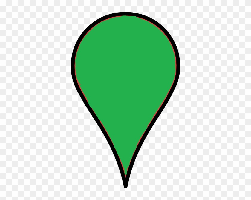 or red in case it is offline
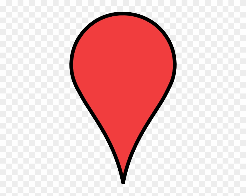 .
.
If you have created a sign(s), it will be shown with a blue marker on the map.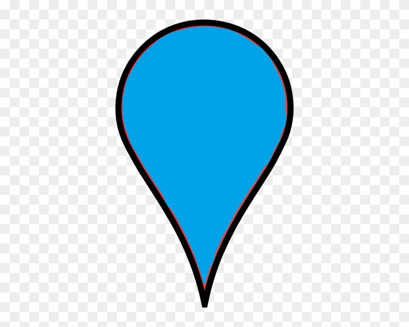
Links and routes also have different colors, from dark red (most congested) to green (normal). These colors are based on each link or route’s average travel speed compared to the Free Flow Speed.
If a link is blue, it means the link is disabled.
Clicking on each link or route opens a pop-up window which displays specific information. This information includes its name, free flow speed, distance, last recorded speed and travel time, last updated time, data source, the sample size (count) of the last interval, and finally, the speed chart of the last 24 hours of data.
The Google map view can be changed using the Map or Satellite view on the map’s upper-left corner 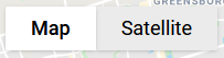 .
.
Map Settings ![]() can be used to show or hide sensors, links, routes, and signs from the map, and Map Data Animation
can be used to show or hide sensors, links, routes, and signs from the map, and Map Data Animation ![]() reloads previously captured data of a specific date and time to show links and routes colors for that period.
reloads previously captured data of a specific date and time to show links and routes colors for that period.