All insight charts’ templates are similar. So even the graphs are different, but their options are the same. Figure 1 is an example of the Link/Route analysis chart that shows all of its options.
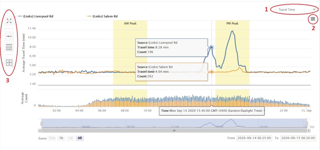
As shown in figure 1, users can switch between travel time and speed charts by simply clicking on the dropdown menu (circle number 1) and choose “Speed” or “Travel Time”.
By clicking on ![]() icon (circle number 2), you can download the chart image in different formats and also the data CSV file.
icon (circle number 2), you can download the chart image in different formats and also the data CSV file.
The icons set on the left side of the chart provide more options for users to change the chart based on their needs.

 : By clicking on this icon, the chart will be shown in full-screen mode. Clicking on this icon again to return to the default view.
 : Hide or show the chart legend by using this option.
 : Clicking on this icon shows the AM and PM peak spans on the chart. AM and PM peak hours can be modified on Setting > Company > Peak Hours Selection.
 : This measurement tool finds the minimum, maximum, and average data of a selected area on a chart. For more information about how this tool works, please watch this 20-second YouTube video.

 : By clicking on this icon, the chart will be shown in full-screen mode. Clicking on this icon again to return to the default view.
 : Hide or show the chart legend by using this option.
 : Clicking on this icon shows the AM and PM peak spans on the chart. AM and PM peak hours can be modified on Setting > Company > Peak Hours Selection.
 : This measurement tool finds the minimum, maximum, and average data of a selected area on a chart. For more information about how this tool works, please watch this